Create app brand assets
Create brand assets
Brand assets package and guidelines are available for anyone working with the Zendesk brand. It contains all the Zendesk brand identity assets – product logos, wordmarks, and various logomark sizes as well as usage guidelines.
Use of the Zendesk logo and brand assets
- App icons - Please don't use Zendesk trademarks (original or modified) in any app icons.
- Naming your app - When naming your app, don't use any Zendesk trademarks or anything that might be construed as related to Zendesk. Do not include any adjectives describing the integration, such as "App name - Intelligent Routing" or "Example Name - Best of breed"
Marketing assets
You must include all the files below in the /assets folder of your app to pass the approval process.
If you are building a multi-product app, you can specify separate marketplace assets per product.
For more details on the structure of the app ZIP, please visit the file requirements section.
Large icon
This icon must meet the following requirements:
- PNG file format
- Filename convention logo.png
- Image size 320x320 pixels
- The image has no rounded corners. The corners are automatically rounded in the UI.
Small icon
Zendesk uses the small app icon in several places. It's the image associated with an app that users see most. The image is also resized depending on the context.
The app icon must meet the following requirements:
- PNG file format
- The PNG uses the PNG-24 format with transparency
- Filename convention logo-small.png
- Image size 128x128 pixels
- The image is visible on both light and dark backgrounds
- The image has no rounded corners. The corners are automatically rounded in the UI.
Screenshots
You must provide three screenshots in the assets folder of your app. Zendesk uses the screenshots in your app listing on the Zendesk Marketplace.
The screenshots must meet the following requirements:
- PNG file format
- Files are named screenshot-x.png where "x" is 0, 1, or 2. For example, "screenshot-0.png", "screenshot-1.png", "screenshot-2.png".
- Image size 1024x768 pixels
- Images have no rounded corners
- Images have no padding and are full bleed.
Designing your icons
Your app icons should capture a user's attention and encourages them to click your icon to learn more. It represents your brand, so avoid using screenshots.
Other guidelines:
- Avoid using text: icons are not aware of multiple locales.
- Avoid extending your icon graphic to the edge of the icon - leave some padding.
- Avoid using edges or borders around the image.
- Simple shapes and flat colors work better than complex designs.
- Your image will be shrunk to half its size, so check it is still clearly visible when resized.
- Assume the image is displayed on a white or light gray background. Avoid using a lot of white color or shades of gray color.
App icon structure
Use the following templates to help you visualize your icon. Square and circular icons are easier to size correctly than icons with pointy edges. For irregular shapes, it's sometimes acceptable to use the entire 128x128 area.
Template for square icons
Template for circular icons
SVG app icons
An app in the top bar, nav bar, or ticket editor location has an additional icon that the user clicks to open the app. This section outlines the image specifications and best practices for the icon. To use and manipulate the icon in your app, see the SVG topic in the SVG icons docs.
File type
Your app icon must be supplied as a SVG file. No other file type will be accepted.
Sizing
Your icon will be displayed at 18px by 18px in a 30px by 30px rounded box. We add 6px padding.
Sizing is handled programmatically so your SVG can be supplied at any size, though we recommend designing your SVG on a square art board. Keep in mind that it could be significantly downsized to 18px x 18px.
Icon shape and the impacts on resizing
You should be aware that icons that do not occupy a square space may appear smaller. Using your app name as the icon is one example. Words occupy a rectangular space, and when scaled down to 18px wide, it will be appear very small and is likely to be illegible:
Choosing an icon that's roughly square will appear more in proportion with the rest of the icons within the navigation
Words occupy a rectangular space. When scaled down to 18px, this results in text becoming illegible
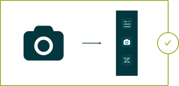
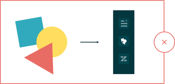
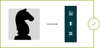
Simple shapes work better for your icon than complex designs
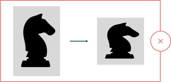
When an icon is scaled down, much of the detail in complex designs can be lost. A simple icon design is much clearer and more recognizable at smaller scales.
Simple designs create a more recognizable icon that still works at smaller sizes
Detail is lost in complex icons when scaled down to 18px wide
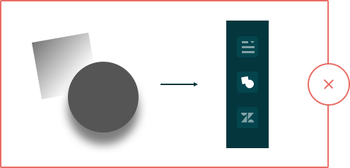
Don't include colors, gradients, shadows or bitmaps
Don't include multiple colors in your .svg file. The fill color will be handled programatically, so any colors that you include will be overwritten. Likewise, don't include gradients, drop shadows, or insert bitmaps into your .svg file.
Multiple colours will be overwritten and filled with one colour. Provide monochrome icons only.
Don't include gradients or drop shadows
Create your icon on a square artboard
If you create your icon on a square artboard, it will be scaled down uniformly to 18px by 18px. If your .svg file is on a rectangular artboard, the image will be stretched or compressed down to a square, distorting your icon.
Create your .svg on a square artboard and it will scale uniformly with no distortion
If designed on a rectangular artboard, your icon will be compressed down to a square, distorting your icon
Optimizing your SVG
Optimize your SVG to ensure it is as small as possible. For example, you can run your app icon through the SVGOMG optimizer by jakearchibald before submitting your app to us.
Next steps: Create content