Designing configuration pages
Use Zendesk Garden base components to produce the configuration pages. The following table describes the design components in a configuration page.
| Component | Description |
|---|---|
| Header | The header contains information helping the Zendesk admin contextualize their location within Admin Center |
| Navigation | The navigation within your integration helps an admin contextualize their location within your integration. When setting up the structure for your integration configuration, first consider your navigation and the complexity of your configuration. See the design templates below |
| Configuration workspace | This is the screen that you should leverage as your configuration workspace. Any configuration you need to surface should be shown within this area |
The design templates provided below accommodates a variety of navigation use cases.
Simple design
Use this template when your integration doesn’t require multiple levels of hierarchy. This is the simplest type of configuration.

Horizontal tabs design
This is the recommended approach in most cases. This provides a simple and easy way for your users to see different content and settings relating to your integration.

Vertical tabs design
With more complex use cases, vertical tabs can be used as they are more scalable when adding in five or more features.

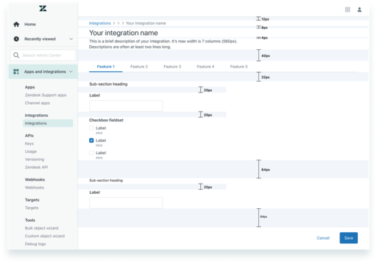
Default configuration page layout and padding
When putting together your configuration page, refer to the following diagram for guidance on spacing between components on the page.
Interactions and behaviors
Skeleton loading states
Use a skeleton loading state whenever you need to demonstrate to the user that loading is occurring. The skeleton structure should be roughly defined by the layout of the actual page so that the loading state sets expectations for the users.

Notifications
Notifications make it possible for users to keep up with the information that matters most to them. Creating simple notifications makes them accessible to people with cognitive and learning disabilities and more usable for everyone.
See Notifications on the Zendesk Garden website.
Do not use notifications in the following scenarios:
- When placing generic content, new features, or changes to Zendesk in an alert notification
- To up-sell or promote products or services. For example, "Buy our product!"
Notification placement
Notifications in Admin Center are 410px wide. They should be placed in the upper-right corner of the screen, below the top nav bar. They should have a 20px margin on all sides, so they do not overlap with any scrollbars that may be present. They should be placed above all other elements on the page.

Notifications should be used for detail view pages such as your integrations home page. This is the part of the top level hierarchy for your integration.
Page level notifications should be used primarily after a user action. Use page level notification when the message relates to an entire page. For example, an “Update successfully done” notification.
When using a form submission, use in-line field validation to inform the user of the specific error. For example, "input must be between 1-100". An additional page level notification lets the user know if the issue is affecting form submission. For example, “Please enter required fields before saving”.
Success notification
The purpose of the success message is to quickly inform the user that their action is completed. The user should see a notification panel in the top right corner of the page.
Success messages appear for 2 seconds and are then dismissed.

Work with the content strategist where possible on developing a succinct message, such as “Sandbox created successfully”. Sometimes only a single line of text is required.
Error notification
The purpose of the error message is to inform the user when something goes wrong or there is unexpected behavior. Ideally, you should provide context to the user on what to do next.
Error messages don’t self-dismiss. They remain visible for the user to read and dismiss.
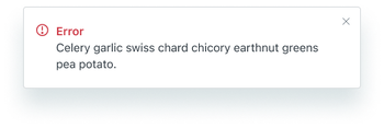
When creating the copy:
- Provide a concise description of the error that is easy to understand
- Provide an indication of how to correct the error
- Include a link to the corresponding page or content where appropriate
Warning notification
Warning notifications don’t self-dismiss. They remain visible for the user to read and dismiss.
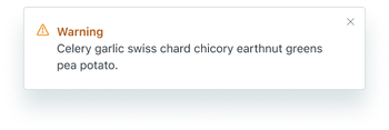
The difference between a warning and an error is that with a warning, users don’t have to change their answers to proceed. In other words, warnings are less serious than errors.
Informational notification
Information notifications don’t self-dismiss. They remain visible for the user to read and dismiss.

The copy should be informative, not action based. Use this notification type when the user needs to be informed of something that happened, but isn’t required to take any action.
Action menu
Use an action menu for detail view pages such as your integrations default or home page. This is the part of the top level hierarchy for your integration.
Action buttons should be used when you have actions that relate to your integration as a whole versus an action that relates to a single feature. For instance, destructive actions such as disabling or disconnecting affect the entire integration and therefore should be put into an action menu.
Multiple actions
If your integration has multiple actions, use the Garden media button with a chevron. Multiple action buttons should be used when you have two or more actions, or one destructive action associated with an object.

Single action
If your integration has a single action, use the Garden default button. Consider if a primary or outline (secondary) button is suitable. A primary button is suitable when a single action is the most likely path the user will take. The outline button should be used when you have a primary button elsewhere, such as in a footer.
This helps direct the user to the right action easily and quickly.

Destructive actions
Place delete and disable actions under the actions button to de-emphasize them.
Destructive actions are unlikely to be the main action the user takes. Therefore, single item menus can be used when you only have one destructive action.

Saving content
Use an action footer to show an interactive form or group of options that needs to be submitted or saved.
The action footer is always pinned to the bottom of the Admin Center UI. It floats above all content. This ensures that it is accessible to the user regardless of their location on the page.

Unsaved changes modal
When a user clicks Cancel after inputting information in a form or submission, an Unsaved Changes modal should be presented.
This modal should inform the user about how their changes will be lost if they cancel and provide them with the ability to return to the previous state.
