Customizing Web Widget colors
The Web Widget messaging customization API gives you real-time control over your widget’s colors using JavaScript. Unlike Admin Center's interface for Web Widget which lets you set static brand colors for all visitors, this API lets you dynamically update widget colors for specific users, sessions, or pages on your site.
Any properties you set using this API temporarily overrides your Admin Center color settings on pages where the JavaScript runs. As long as the script is present, your custom colors will be applied each time the page loads. If you remove the script or visit a page without it, the widget returns to your Admin Center default colors.
| Method | Who sees it? | When does it revert? |
|---|---|---|
| Admin Center appearance | All visitors, everywhere | When you update the color in Admin Center |
| JavaScript customization | Only on pages with the custom code | When the code is removed from the page |
API usage
Call zE("messenger:set", "customization") from your web page to update the widget's colors. You can call this function at any time once the widget is loaded. The widget will immediately apply the new colors.
zE("messenger:set", "customization", {theme: {primary: "#FE5E41",onPrimary: "#FFFFFF",message: "#F3C178",onMessage: "#5F0F00",action: "#B0DB43",onAction: "#000000",businessMessage: "#fff",onBusinessMessage: "#F10404",background: "#DFE0E2",onBackground: "#F10404",error: "#FF1744",onError: "#FFFFFF",notify: "#FF007F",onNotify: "#FFFFFF"}})
The theme object defines colors for the widget interface. All color values must be valid CSS color strings, such as hex, rgb, hsl, or named colors. Unknown properties or invalid color values will trigger an error in the browser console and no colors will change.
Theme color properties
The theme object supports these properties:
| Property | Description |
|---|---|
| primary | The widget’s main color. Used for the messenger launcher button, top bar, footer highlights, and key UI elements. |
| onPrimary | The color of text and icons on primary-colored backgrounds, such as the launcher button icon or main widget action buttons. |
| message | Background color for the end user’s chat bubbles. |
| onMessage | The color of text inside the end user chat bubbles. |
| businessMessage | Background color for agent or bot chat bubbles. These are messages sent by Zendesk or your team. |
| onBusinessMessage | The color of text and icons within the agent or bot bubbles. |
| action | Background color for action buttons such as creating new conversation, message, forms and carousel buttons. |
| onAction | Text and icon color on action backgrounds. |
| background | The main background color for the widget’s window behind the chat bubbles and input fields. |
| onBackground | The default text and icon color that appears over the widget’s background. |
| error | Background color for alert elements such as failed messages or upload errors. |
| onError | Text and icon color on error backgrounds. |
| notify | Background color for some notification banners or messages. |
| onNotify | Text and icon color used in some notification banners or messages on top of the notify background. |
| onSecondaryAction | Text or icon color for secondary action buttons inside the widget, such as “Cancel” or “Back.” |
Fallback behavior
If primary, message, or action colors are not set, the widget uses the colors configured in Admin Center. The default colors are:
| Property | Hex Code | Color Name/Description |
|---|---|---|
| primary | Admin Center primary color | |
| onPrimary | Black or white for accessibility | |
| message | Admin Center message color | |
| onMessage | Black or white for accessibility | |
| action | Admin Center action color | |
| onAction | Black or white for accessibility | |
| businessMessage | #F4F6F8 | Very light gray |
| onBusinessMessage | #000000 | Black |
| background | #FFFFFF | White |
| onBackground | #000000 | Black |
| error | #FFF0F1 | Very pale red |
| onError | #8C232C | Dark red |
| notify | #CC3340 | Medium red |
| onNotify | #FFFFFF | White |
| onSecondaryAction | Falls back to action color |
Unsupported elements
The following widget elements use fixed colors and cannot be customized with this API:
- Wait time banner
- Forms and form inputs, including text fields
- Settings dropdown menus
- Carousel UI elements
Testing colors
Use a staging site with the widget installed to test the JavaScript theme customizations. You cannot use Admin Center's preview.
Another option is to create a test HTML page to test color schemes. To do this:
-
Create a
ww-color-testfolder and change directory into it. -
Create a
color-picker.htmlfile and copy the following contents into it:<!DOCTYPE html><html lang="en"><head><meta charset="UTF-8"><title>Zendesk Messaging Web Widget Demo</title></head><body><h2>Zendesk Messaging Widget</h2><p>This page loads the Zendesk Messaging Web Widget in the lower right corner.</p><!-- Paste your widget snippet with your key below --></body></html> -
In Admin Center, click Channels in the sidebar, then select Messaging and social > Messaging.
-
Click your Web Widget channel name, then expand the Installation section.
-
Click the Copy icon at the bottom of the code snippet frame.
-
Paste the code snippet after the
Paste your widget snippet with your key belowline and before</body>. It should look similar to this:<body><h2>Zendesk Messaging Widget</h2><p>This page loads the Zendesk Messaging Web Widget in the lower right corner.</p><!-- Paste your widget snippet with your key below --><script id="ze-snippet" src="https://static.zdassets.com/ekr/snippet.js?key=abcd-1234"> </script></body> -
Open
color-picker.htmlin your browser. -
Open your browser's console.
-
Enter the following in the console and view the changes:
zE('messenger:set', 'customization', {theme: {primary: '#0074D9', // Brand blueonPrimary: '#FFFFFF', // White text on buttonsmessage: '#F1F8FF', // Light blue user message bubbleonMessage: '#003366', // Dark blue text in user bubbleserror: '#FF5555', // Custom error backgroundonError: '#FFFFFF' // White error text}}); -
Experiment with other properties and colors.
Visual examples of customizable properties
| primary | 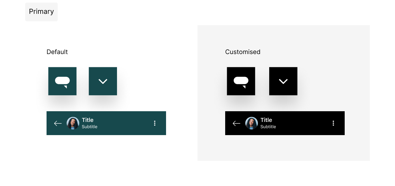 Click to view full size Click to view full size |
| onPrimary | 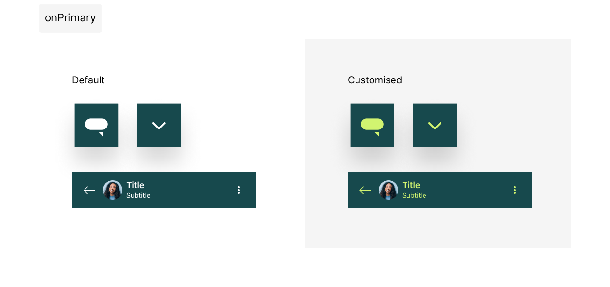 Click to view full size Click to view full size |
| message | 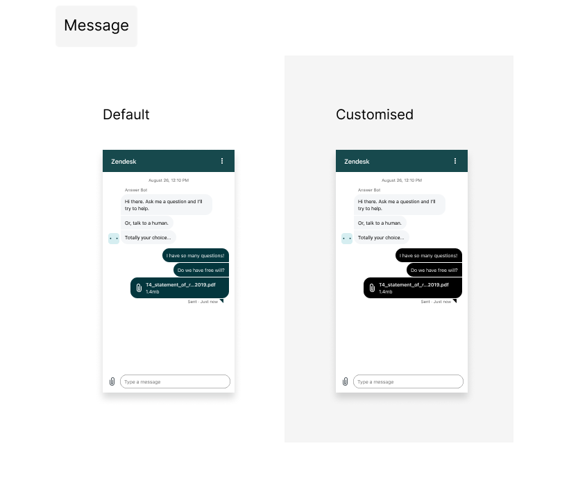 Click to view full size Click to view full size |
| onMessage | 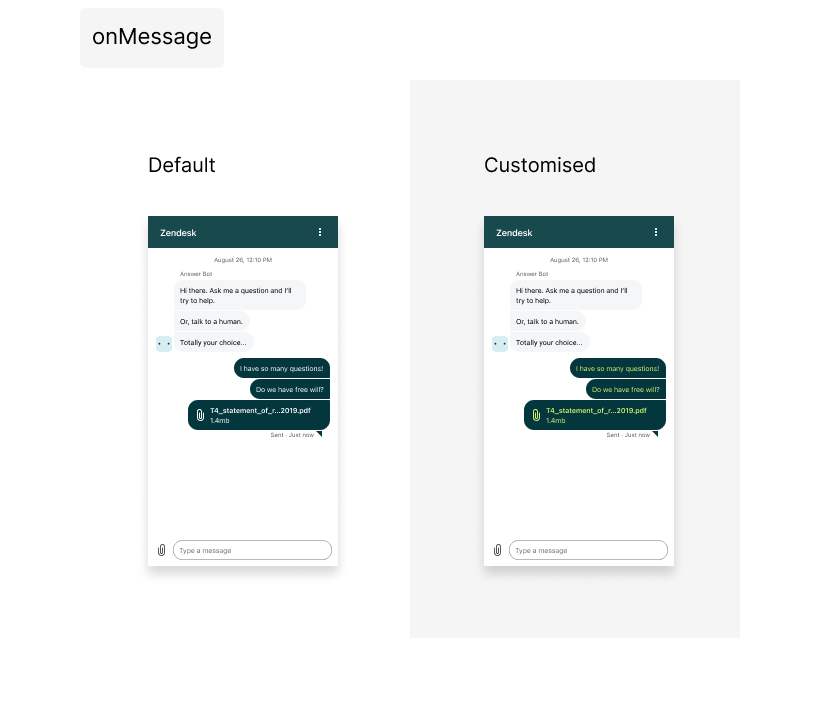 Click to view full size Click to view full size |
| action | 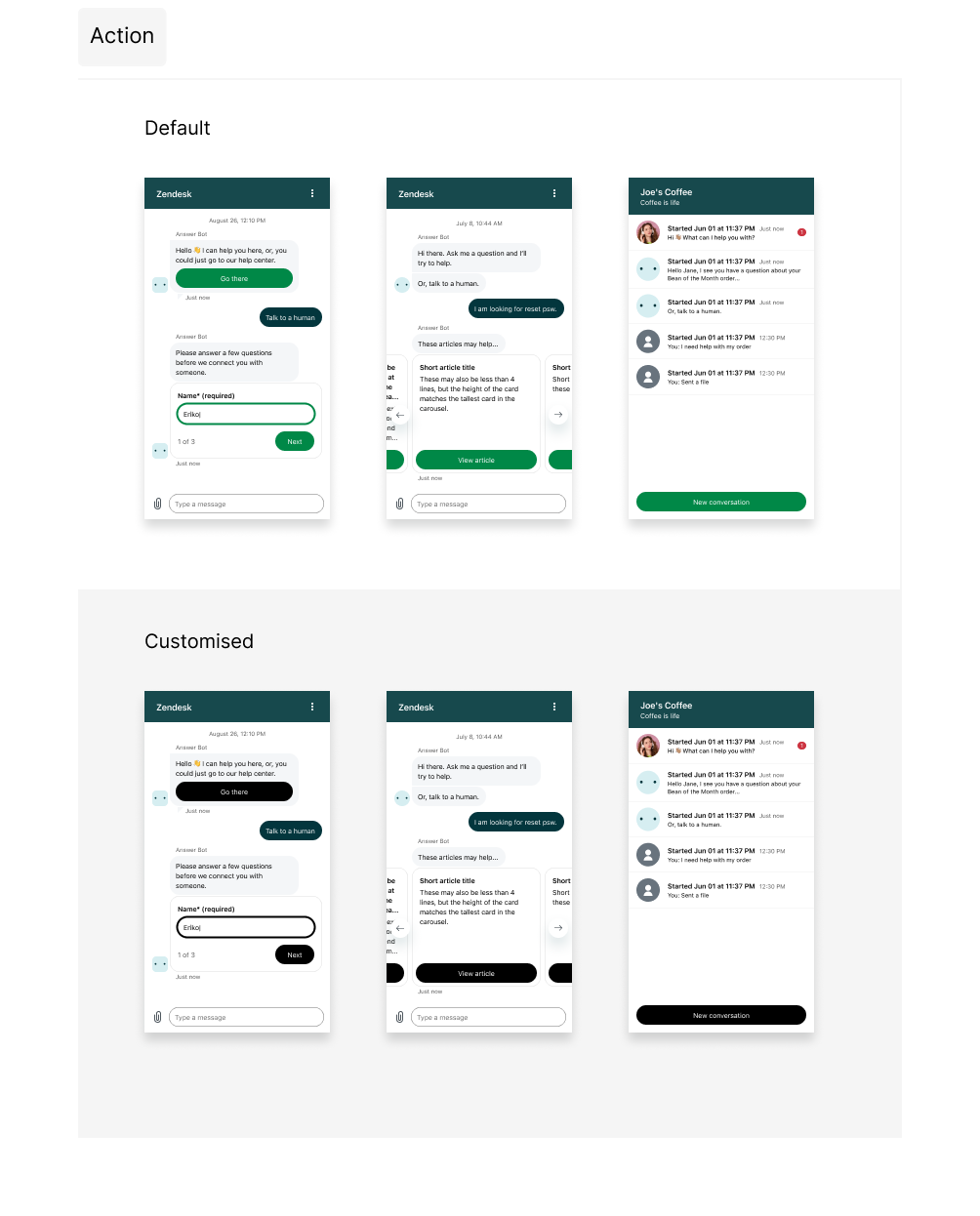 Click to view full size Click to view full size |
| onAction | 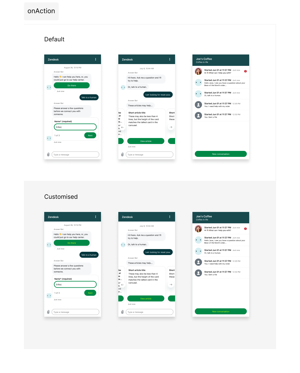 Click to view full size Click to view full size |
| businessMessage | 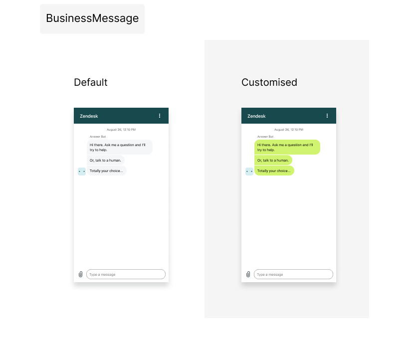 Click to view full size Click to view full size |
| onbusinessMessage | 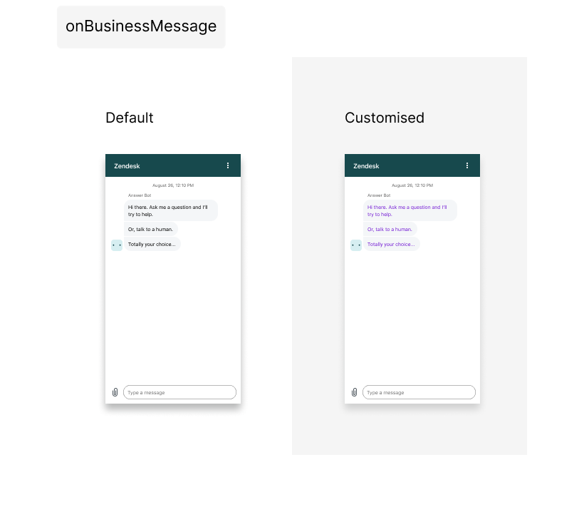 Click to view full size Click to view full size |
| background | 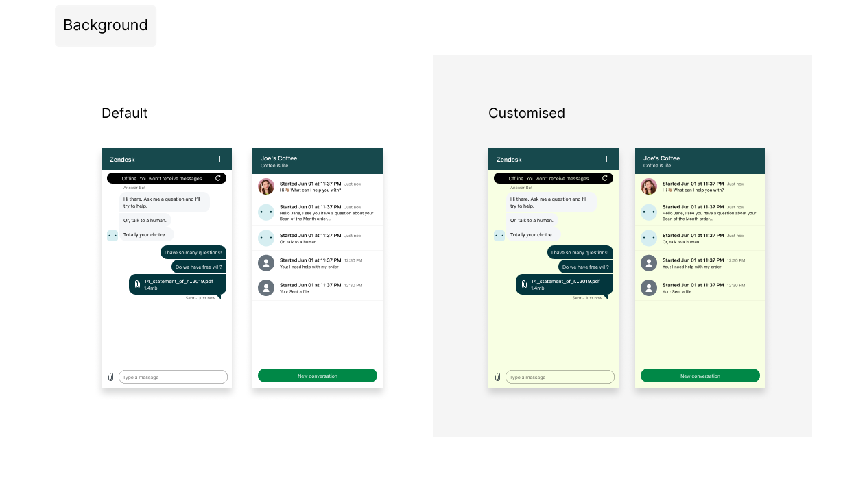 Click to view full size Click to view full size |
| onBackground | 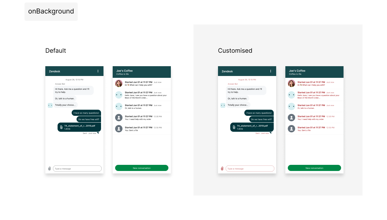 Click to view full size Click to view full size |
| error | 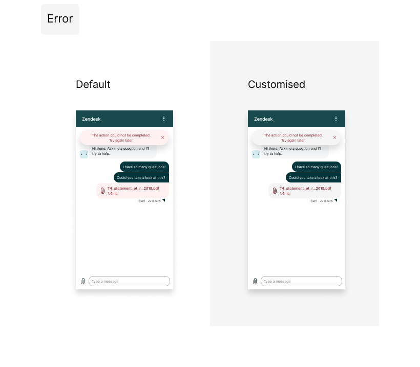 Click to view full size Click to view full size |
| onError | 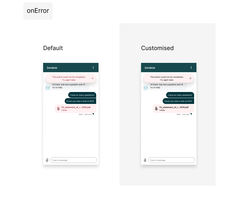 Click to view full size Click to view full size |
| notify | 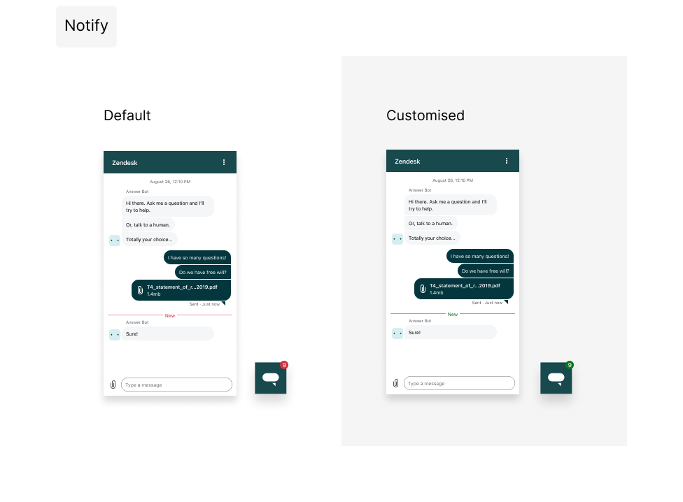 Click to view full size Click to view full size |
| onNotify |  Click to view full size Click to view full size |
| onSecondaryAction | 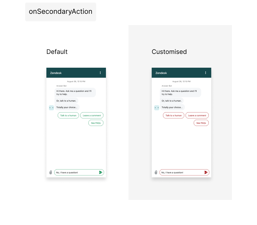 Click to view full size Click to view full size |
Troubleshooting
- Check the browser console for errors if your colors do not show.
- All property names must be correct and all color values must be valid CSS strings.