Quick start - Creating a custom launcher for the messaging Web Widget
Note: Zendesk has renamed our bot capabilities. Answer Bot is now AI agents.
This hands-on tutorial shows you how to embed a custom messaging Web Widget launcher on a web page and configure some basic settings using Zendesk Web Widget APIs.
Note: Messaging Web Widget lets you embed messaging functionality in your website and is not the same as Web Widget (Classic). See Comparing the Zendesk Web Widgets for more information.
The launcher is the UI element the customer clicks to open the widget. For example, it can be a button or a link on your webpage. Basic widget configuration can be performed in the Admin Center.
The messaging Web Widget APIs are client-side JavaScript APIs that can be used in your website and provide more extensive widget customizations. They let you perform actions on the widget using commands. This quickstart shows you how to work with some of those commands.
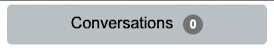
In this tutorial, you’ll create a custom launcher button that has a “Conversations” label and displays the number of unread conversations. The button will perform a shake animation when there are unread conversations.
This tutorial uses JSFiddle, a free online code editor with live page previews. You can, however, use other preview code editors such as CodePen and JS Bin.
You'll need a Zendesk Support account or a trial account. You can request a sponsored test account that doesn't expire after 14 days like the trial account.
Make sure the help center is enabled in your Zendesk Support account. See Getting started with Guide in Zendesk help.
You'll also need an AI agent configured and published for your Zendesk Support or trial account. See Creating an AI agent for your web and mobile channels for more information.
Though not necessary to work through this quickstart, a general understanding of HTML and JavaScript is recommended. For more information, see HTML Introduction and JavaScript MDN.
Disclaimer: Zendesk provides this article for instructional purposes only. Zendesk can't provide support for third-party technologies such as JavaScript. Please post any issues in the Zendesk SDKs community, or search for a solution online.
Creating a sample page
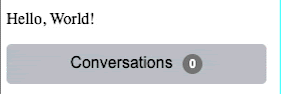
In this section, we'll create a "Hello World" page using JSFiddle.
-
In your web browser, go to https://jsfiddle.net/.
-
Copy and paste the following HTML code into the HTML editor located in the upper left UI panel of JSFiddle.
<!DOCTYPE html><html lang="en"><head><title>Hello World!</title></head><body><p>Hello, World!</p></body></html>
Adding the widget to your web page
To add the widget on your web page, you need to copy the Web Widget script located in Admin Center.
-
In Admin Center, click Channels in the sidebar, then select Messaging and social > Messaging.
-
Click Web Widget.
The widget’s edit page opens.
-
Click the Style tab.
-
For Title, enter Example Custom Launcher.
-
For Shape, click Custom Launcher.
-
Click Save settings.
-
Click the Responses tab.
-
At the bottom of the page, click Add a bot.
-
Click the Installation tab.
-
Click the Copy icon at the bottom of the code snippet frame.
-
Click the checkbox to Automatically embed Web Widget in your Help Center.
-
Click Save settings.
In JSFiddle, paste the code snippet before the closing body tag in the HTML panel. Your HTML should look as follows:
<!DOCTYPE html><html lang="en"><head><title>Hello World!</title></head><body><p>Hello, World!</p><!-- Start of z3nabcd Zendesk Widget script --><script id="ze-snippet" src="https://static.zdassets.com/ekr/snippet.js?key=18d3ed2d-b8d1-4abc-988f-8c109efc88bf"> </script><!-- End of z3nabcd Zendesk Widget script --></body></html>
Building a custom launcher
After adding the widget to your web page, creating your custom launcher requires three steps:
- Add the
<div>element to the web page for your custom launcher. - Use HTML and CSS to customize your launcher style and format.
- Use client-side Web Widget APIs to define how you want the launcher and widget to behave.
Adding the launcher div element to your web page
The <div> element you’ll add to the web page contains the following launcher-related content:
- An id with the name “conversation-badge”
- Custom launcher button text of “Conversations”
- Number of unread conversations is one
These settings are used by JavaScript to set variable values.
Copy and paste the following after the Web Widget code snippet but before the closing body tag in the HTML panel of JSFiddle.
<div id='conversation-badge'><span>Conversations</span><span id='unread-indicator'>1</span></div>
Your HTML should look as follows:
<!DOCTYPE html><html lang="en"><head><title>Hello World!</title></head><body><p>Hello, World!</p><!-- Start of z3nabcd Zendesk Widget script --><script id="ze-snippet" src="https://static.zdassets.com/ekr/snippet.js?key=18d3ed2d-b8d1-4abc-988f-8c109efc88bf"> </script><!-- End of z3nabcd Zendesk Widget script --><div id='conversation-badge'><span>Conversations</span><span id='unread-indicator'>1</span></div></body></html>
Customizing your launcher style and format
We'll now use CSS to customize the style and format of our launcher button.
Our launcher button has the following design properties:
- Button color is light gray
- Button text color is black
- Button text is center-aligned
- Text font family is Arial, Helvetica, and sans-serif
- 10px by 30px padding
- Button size is 200px by 20px
- Button corners rounded with a radius of 5px
- Set the button as a block level flex container so that items inside the button automatically change their size and location according to the size of the button
- The cursor shape is a pointer when hovering over the button
The conversation-badge CSS rule sets the format and layout for the button. It contains the properties and values for the launcher that we have defined above. Copy and paste the following into the CSS panel of your JSFiddle editor.
#conversation-badge {background: #D4D4D4;color: Black;width: 200px;height: 20px;border-radius: 5px;display: flex;justify-content: center;font-family: Arial, Helvetica, sans-serif;padding: 10px 30px;cursor: pointer;}
Now use CSS to customize the style and format of the unread conversations counter.
Our unread conversations counter has the following design properties:
- Text color is white
- Text is center aligned
- Text font size is 12px
- Font weight is Semi Bold
- Distance between lines of text is 1.7
- Background color is black
- Border radius corners are 50%
- Minimum width of the counter background circle is 20px
- Height of counter background circle is 20px
- Space between the launcher text and the counter is 10px
The unread-indicator CSS rule sets the format and layout for the unread conversations. It contains the properties and values that we have defined above. Copy and paste the following into the CSS panel of your JSFiddle editor below the conversation-badge rule.
#unread-indicator {color: white;text-align: center;font-size: 12px;line-height: 1.7;background: black;border-radius: 50%;min-width: 20px;height: 20px;font-weight: 600;margin-left: 10px;}
The @keyframes CSS defines the shake animation. It starts horizontal, rotates 5 degrees, returns to horizontal, rotates -5 degrees, and then returns back to horizontal. The animation duration is 0.25 seconds.
Copy and paste the following into the CSS panel of your JSFiddle editor below the unread-indicator rule.
@keyframes tilt-shaking {0% { transform: rotate(0deg); }25% { transform: rotate(5deg); }50% { transform: rotate(0eg); }75% { transform: rotate(-5deg); }100% { transform: rotate(0deg); }}.tilt-animation {animation: tilt-shaking 0.25s;}
Your entire CSS should look as follows:
/* elements in page */#conversation-badge {background: #D4D4D4;color: black;width: 200px;height: 20px;border-radius: 5px;display: flex;justify-content: center;font-family: Arial, Helvetica, sans-serif;padding: 10px 30px;cursor: pointer;}#unread-indicator {color: white;text-align: center;font-size: 12px;line-height: 1.7;background: black;border-radius: 50%;min-width: 20px;height: 20px;font-weight: 600;margin-left: 10px;}/* css for tilt animation */@keyframes tilt-shaking {0% { transform: rotate(0deg); }25% { transform: rotate(5deg); }50% { transform: rotate(0eg); }75% { transform: rotate(-5deg); }100% { transform: rotate(0deg); }}.tilt-animation {animation: tilt-shaking 0.25s;}
Defining the custom launcher and Web Widget behavior
The custom launcher and widget behavior are configured using Web Widget API commands.
For this tutorial, copy the following code and paste it into the JavaScript panel of JSFiddle.
const conversationBadge = document.querySelector('#conversation-badge')const unreadIndicator = document.querySelector('#unread-indicator')const populateUnreadIndicator = (count) => {if (!count) return resetUnreadIndicator()unreadIndicator.style.background = '#CC3333'unreadIndicator.innerHTML = countconversationBadge.setAttribute('class', 'tilt-animation');}const resetUnreadIndicator = () => {unreadIndicator.style.background = 'black'unreadIndicator.innerHTML = 0conversationBadge.setAttribute('class', '');}// unread Message on listenerzE('messenger:on', 'unreadMessages', (count) => {populateUnreadIndicator(count)})// on page load always close widgetzE('messenger', 'close');conversationBadge.onclick = () => {// open widgetzE('messenger', 'open');}
Closing the launcher on page load
The zE('messenger', 'close') command prevents the Web Widget from being displayed when the page is first loaded.
Clicking the custom launcher opens the widget
When you click the custom launcher button, zE(‘messenger’, ‘open’) opens the Web Widget. The resetUnreadIndicator function is called and performs the following actions:
- Sets the background color to black (when there are unread messages, the background color is red)
- Sets the number of unread messages to 0
- Sets the class attribute so that no animation is performed
const resetUnreadIndicator = () => {unreadIndicator.style.background = 'black'unreadIndicator.innerHTML = 0conversationBadge.setAttribute('class', '');}
Listening for messages
zE('messenger:on', 'unreadMessages', (count)) executes a callback to the populateUnreadIndicator function when the number of unread messages changes. This function performs the following actions:
- Sets the background color of the counter circle to red
- Updates the count to show the number of unread messages
- Sets the class attribute so that a shake animation is performed
const populateUnreadIndicator = (count) => {if (!count) return resetUnreadIndicator()unreadIndicator.style.background = '#CC3333'unreadIndicator.innerHTML = countconversationBadge.setAttribute('class', 'tilt-animation');}
Try it out
To test your custom launcher:
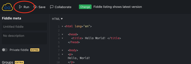
- In JSFiddle, click the Run icon located in the upper left corner. The console in the lower right corner shows your web page.
-
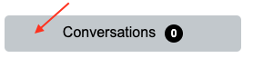
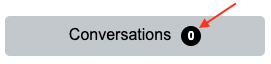
Click the custom launcher button.
-
Enter Articles.
-
Press Return and quickly press Esc before the bot can respond.
The custom launcher button animates, the counter is updated, and the circle behind the counter turns red.