User interface design fundamentals
Introduction
Creating a consistent experience is fundamental to designing apps that feel part of the Zendesk product. This guide walks you through our design principles, from the importance of spacing and sizing, through typography and color schemes, to handling disabled components and localization considerations.
These specifications come from Garden, Zendesk’s design system, that is used for the Zendesk product. While you can use your own design system, adhering to these fundamentals wherever possible is encouraged to help create a consistent user experience.
See Designing with Zendesk Garden for more information.
Accessibility
Accessibility is a fundamental aspect of design at Zendesk. Not only is it important when considering those with temporary or permanent impairment, it is also shown to improve the usability of products for everyone. Zendesk adheres to the WCAG 2.1 guidelines and we encourage app developers to adhere to these guidelines as well.
See Zendesk product accessibility for more information on Zendesk's commitment to accessibility.
Spacing and sizing
When you design an app, it's important to account for the limited available space. As a general guideline, try to keep a compact and straightforward app layout.
Garden components use the base-4 system, where attributes like text sizes and spacings are in multiples of 4px. Using a predefined set of spacing values from Garden ensures a consistent user experience.
| Spacing | Garden value |
|---|---|
| 4px | xxs |
| 8px | xs |
| 12px | sm |
| 20px | md |
| 32px | lg |
| 40px | xl |
| 48px | xll |
Typography
By default, the Zendesk interface uses the San Francisco (SF) typeface, with a font size of 14px and a line-height of 20px, using semi-bold for emphasis.
The SF font can be downloaded free of charge from the Apple website.
Below is a quick summary of typography styles that might come in handy when designing your app.
| Component | Font | Size | Line height | Garden value | Hex value |
|---|---|---|---|---|---|
| Default | SF Pro - Regular | 14px | 20px | grey-800 | #2F3941 |
| Labels | SF Pro - Semi-Bold | 14px | 20px | grey-800 | #2F3941 |
| Hint & Empty state | SF Pro - Regular | 14px | 20px | grey-600 | #68737D |
| Placeholder | SF Pro - Regular | 14px | 20px | grey-400 | #C2C8CC |
| Text link | SF Pro - Regular | 14px | 20px | blue-600 | #1F73B7 |
Colors
The Zendesk interface places strong focus on the importance of color considerations to ensure aspects such as contrast ratios comply with accessibility guidelines.
Below is a list of colors used with our common elements.
| Buttons | State | Garden value | Hex value |
|---|---|---|---|
| Default | blue-600 | #1F73B7 | |
| Hover, active and focus | blue-700 | #144A75 | |
| Icons | State | Garden value | Hex value |
| Default | grey-600 | #68737D | |
| Hover, active and focus (if interactive) | grey-700 | #49545C | |
| System status | State | Garden value | Hex value |
| Error | red-600 | #CC3340 | |
| Warning | yellow-700 | #AD5918 | |
| Success | green-600 | #038153 | |
Although these are the most commonly used colours within the Zendesk interface, Garden includes a range of colours and shades to make your experience feel like Zendesk.
Disabled components
Avoid using any disabled components unless there’s a necessary reason. However, in certain cases, you can show disabled buttons to avoid having buttons constantly appear and disappear which can be confusing for the end user.
General guidelines
Here are some general guidelines when creating your user interface.
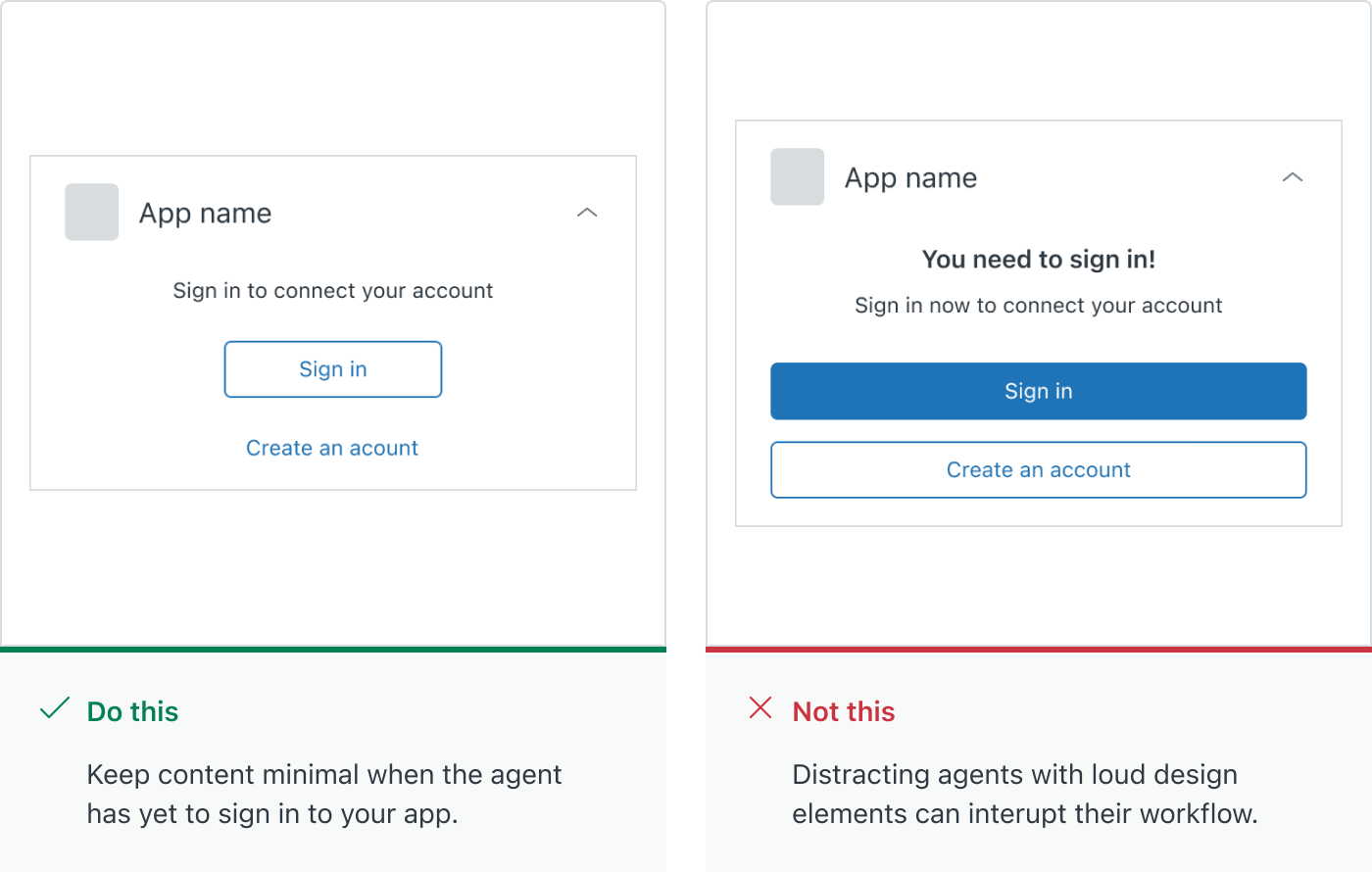
Prioritize simplicity and speed in authentication
Apps integrating with other services will likely need some form of authentication during setup. Ideally, this should occur when your app is first set up. However, if your app requires individual agents to log in, consider the following:
-
Place settings that affect all users on the Settings page, not within the app itself.
-
Simplify the unauthenticated user experience to minimize distraction. Use concise text to relay your message, and secondary and tertiary button styles for any calls to action.
Make errors clear and recoverable where possible
Providing a great experience means helping users when they encounter issues. Here are some guidelines to help you effectively communicate problems and to help users recovery quickly:
-
Use straightforward language to clarify what triggered the error and how the user can resolve it.
-
Use a Garden Alert Notification and place it in the context of where the issue occurred.
-
Provide a "Retry" action when your app doesn’t function as expected. For example, if it doesn’t load correctly, or it runs in to an error when performing an action.
-
For form elements, display the error inline. Garden’s form fields have this style built in and available.
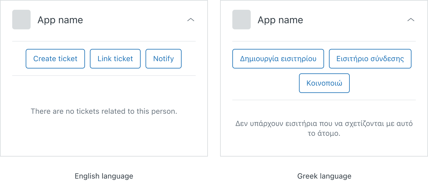
Consider how your app responds when localized to other languages
Zendesk places great emphasis on creating products that are easy to use by people worldwide, and we encourage app developers to do the same.
-
Test how other languages affect the size and spacing of components in your apps. For example, buttons may expand in width and wrap in certain situations.
-
If content wrapping is necessary to accommodate other languages, consider the height of your app and adjust as needed.
Further reading
Learn how Zendesk Garden can be used to create a consistent experience and expedite the design and development of apps.