Sidebar apps (Support)
Introduction
This document outlines Zendesk’s design recommendations for sidebar apps to help developers create a consistent experience with the rest of Zendesk’s products. This document is written whether or not you are using Garden, Zendesk’s design system, as many of these principles apply even if you are using your own design system or UI components.
Where sidebar apps are displayed
In Support, sidebar apps are displayed in the apps tray. The following views contain an apps tray:
-
Ticket view
-
New ticket view
-
User view
-
Organization view
Anatomy of a sidebar app
Note: Zendesk is working on a visual update to the app container in the Agent Workspace. These changes will not affect the apps themselves and will gradually be rolled out to all Zendesk accounts.
The sidebar app you develop will be wrapped inside a prebuilt container that provides additional information and functionality to agents. While you cannot change this design, it’s important to have the context of how it looks and works:
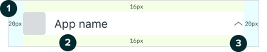
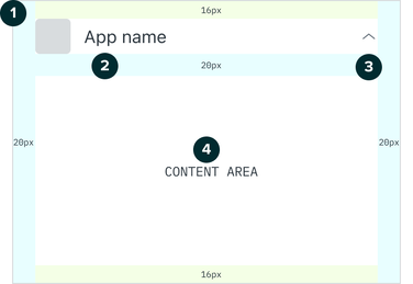
-
App icon - uses the icon provided in the /assets folder of your app. Learn more about app assets.
-
App name - specified in the manifest file. Learn more about the manifest.
-
Expand and collapse toggle - allows agents to minimize the app when it’s not needed.
-
Content area - where the app you develop will appear.
How the Agent Workspace impacts apps
The Agent Workspace is a unified space for agents to manage and respond to customer support requests. It is an optional experience that is toggled on by the admin of each Zendesk instance. Those that do not have the Agent Workspace enabled continue to use the standard agent interface.
While your app will work automatically in both cases, it’s important to be aware of the differences and how they affect your app and it’s experience.
Agents can change the apps tray's width
In the Agent Workspace, agents can resize the apps tray. The following table outlines possible widths for the Agent Workspace and the standard agent interface.
| Agent Workspace | Standard agent interface |
|---|---|
| Width: | Width: |
| * Responsive | * Fixed |
| * 200px minimum (excluding container padding) | * 320px (excluding container padding) |
| * No maximum |
Agents often resize the apps tray based on their focus. Keep this focus in mind when designing your app. This will help your app display useful information at different widths.
Focus on apps
The agent has made the apps tray wider, placing a priority on their apps. This suggests the agent wants to complete a task rather than focus on a conversation. If possible, use the extra space to help the agent complete their task in your app. For example, your app may provide extra details in search results.
Focus on conversation
The agent has the apps tray open at its minimum width. This suggests the agent is focused on a conversation. At this width, only display information the agent may use during the conversation.
Apps will be used at different widths
Now that apps can be viewed at different widths in the Agent Workspace, it’s important to understand how this will impact the usability of your app. Consider the following:
-
Make sure design elements don’t overlap, and important text doesn’t truncate at smaller widths.
-
Make sure your app feels well structured at larger sizes by keeping components aligned relative to each other, and stretch elements and unwrap text to use the space where it makes sense.
Dos and Don'ts
1. Don’t use primary button styles when your app first loads
Your app will likely live in a workspace in context of many other things an agent will interact with. Given the broader context, it’s important to reduce the amount of distraction to an agent to help them keep focus on their task.
The Zendesk interface uses different styles of buttons depending on the circumstance. Here is a quick overview of how you can use the button styles within your app:

-
Primary buttons are for the most important action in a given view. For apps, only use these after an agent has interacted with your app.
-
Secondary buttons are for secondary actions, and are an alternative you can use for buttons shown when the app initially loads.
-
Tertiary buttons are for repetitive or de-emphasised actions in a given view.
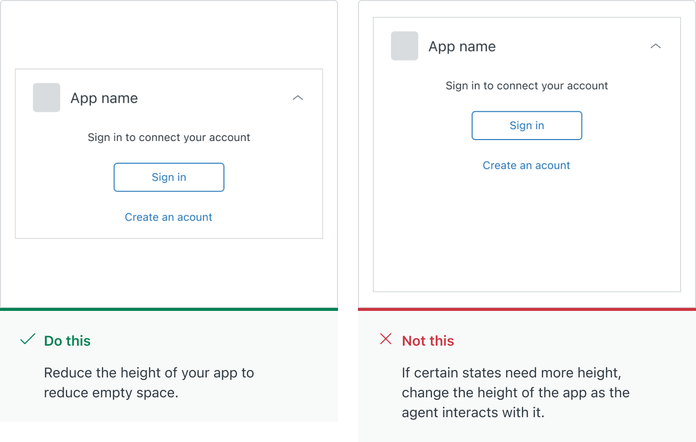
2. Tailor your app’s height where it makes sense
As users interact with your app, the amount of data and information they’ll be subject to will change.
-
If your app is dynamic in nature, consider its height in different states and avoid unnecessary empty space.
-
Avoid drastic changes in height, as this can be a disorientating experience for agents.
-
Only change the height of your app when an agent does an action, such as signing in to an account, or conducting a search.
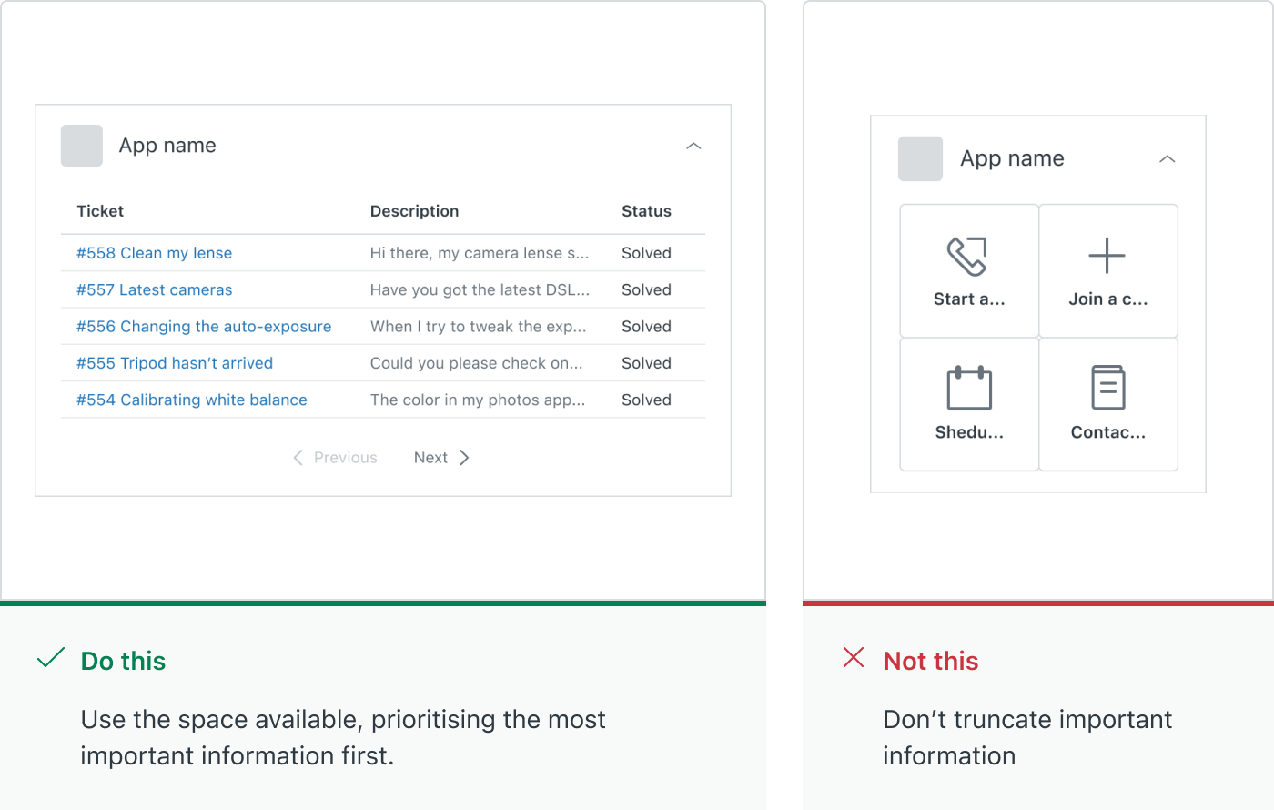
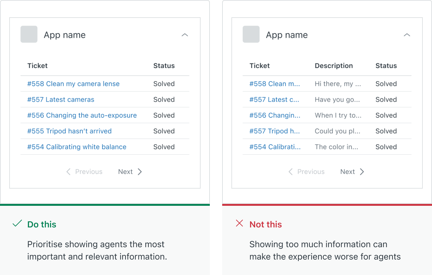
3. Be mindful of the amount of data displayed at once
Many developers use apps to surface information that provides additional context, resolves an issue or answers a question for the agent. A table is a great way to display data in a structured way and the following guidelines will help you to create a focussed experience for agents:
-
Use a table with no more than two columns to display the most relevant information to users.
-
Avoid showing many more than 5 rows of information to keep the height of your app from becoming excessively long.
-
Use pagination to let users parse through a larger set of results. Garden has [Pagination components well suited to this scenario.
-
Include search functionality if you’re working with a large set of data, to help agents find what they’re looking for as quickly as possible.
-
Where it makes sense, use tabs or accordions to separate content in a way that helps manage how much is shown at a time.
Further reading
-
Read up on some of the UI fundamentals Zendesk uses in all of it’s products.
-
Learn about Zendesk’s tone and voice to help write like Zendesk.
-
Explore the Garden website to see all of the components available.