Top bar apps (Support)
Introduction
This document outlines Zendesk’s design recommendations for top bar apps to help developers create a consistent experience with the rest of Zendesk’s products. This document is written whether or not you are using Garden, Zendesk’s design system, as many of these principles apply even if you are using your own design system or UI components.
Where do top bar apps live
Top bar apps are located in one of Zendesk's most prized positions in Support.
Top bar apps gives Agents the ability to improve their workflow with minimal distraction so they can focus on their work. The app location persists across Support much like a global setting.
Agents can click on any one of the apps in the top bar navigation whenever they need, without it taking over their workspace.
Top bar apps are useful to help amplify the way Agents work today.
For apps that don’t require a full page view or a lot of screen real estate, top bar is a good choice of location for an Agent. If an app requires more focus time and input, this is where we recommend using the sidebar location.
How are they accessed
Top bar apps are installed directly into Admin Centre once an Agent installs it from the Zendesk Marketplace. Apps can also be uploaded privately via the Admin Centre.
Apps are available immediately in Support for Agents to begin using right away.
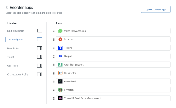
One of the benefits of using Top Bar Apps is they can be re-ordered positioned in a way that makes sense to a workspace.
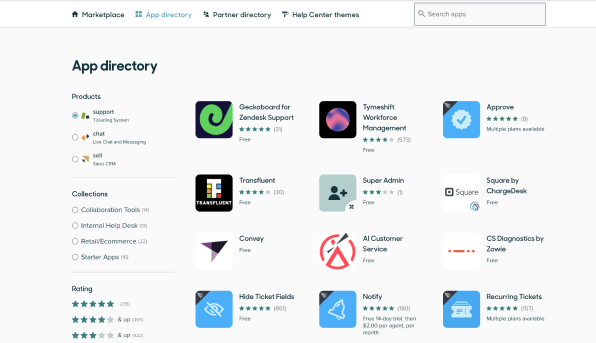
Come one come all to the Marketplace
Top Bar Apps are found in the app directory on the Zendesk Marketplace for Admins to research, browse and install.
While we currently do not support filtering by location, Admins can sort through apps on the Marketplace by product: e.g Support, Ticketing system.
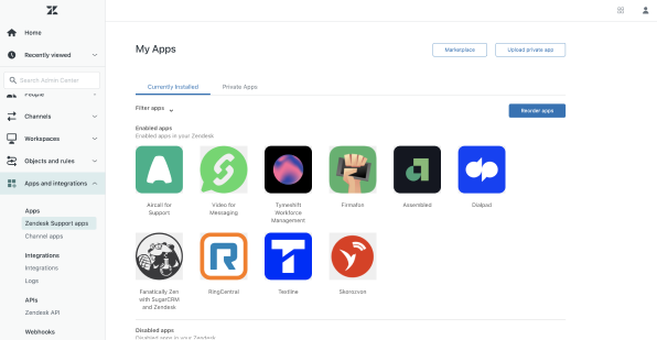
Where are the apps saved?
Once the app is installed, Admins can access installed apps in the Admin Centre under “Zendesk Support apps”.
Reordering of apps
While Agents do not have access to customise the order of how their apps are positioned in Support, Admins will be able to do this via the Admin Centre.
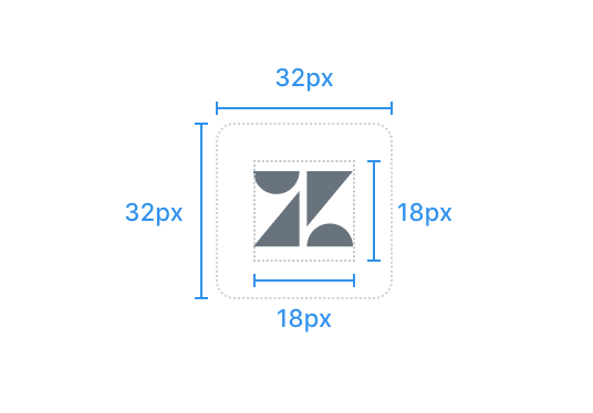
App icon guideline
Top bar layouts use uniform elements and spacing to encourage consistency across platforms, environments, and screen sizes.
Icon specifications
Your logo plays an important part of your brand identity. We’ve put together tried and tested tips for the most successful icon published in Support. Follow these guidelines below and you’ll be well on your way.
Do’s and Don’ts
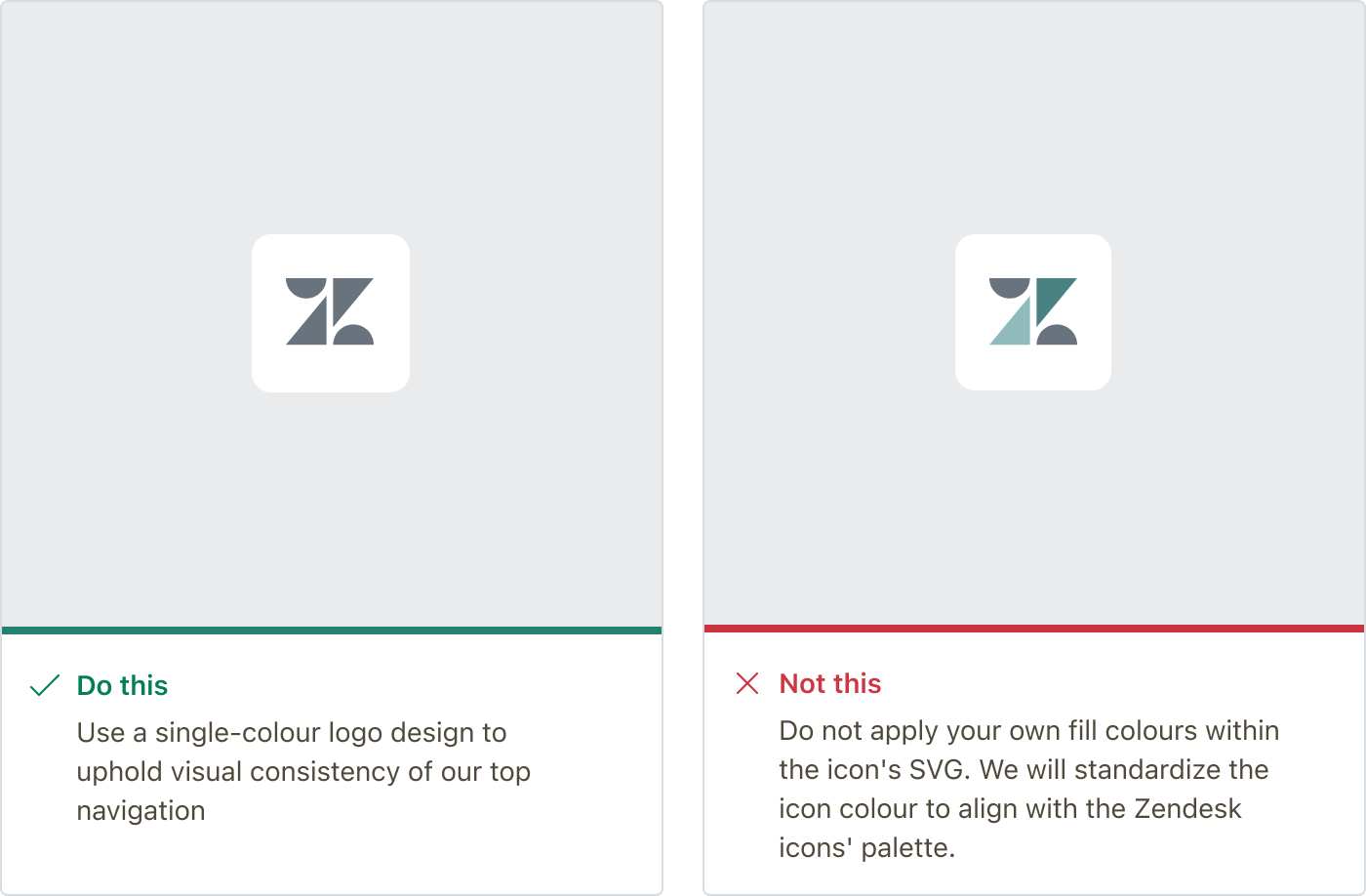
Avoid custom fill properties
To maintain a cohesive appearance in the top navigation, Zendesk applies a consistent fill color to all app logos. Zendesk recommends you choose an icon design that remains recognizable when displayed in a single color. Avoid using the fill attribute within your app icon’s SVG file because hardcoding specific colors can result in visual inconsistencies with the standardized look of Zendesk and other third-party app icons in the top navigation.
If your app icon appears inconsistent, check whether the fill attribute in your logo’s SVG is causing the issue.
Help your logo appear as it is
Setting your logo within a square shape will give your icon the best chance of appearing to scale (and not distorted).
Aim for simplicity
You’ll see in the example below simple shapes work better for your icon than a detailed design. Especially when the icon A simple icon design is much clearer and more recognizable at a smaller scale.
Aim for consistency
Along with the icon you set for your top bar app, you have the ability to provide an image of your logo to sit within the top header of the app. Consider using similar colours and help tie the branding together. Another consideration is to ensure any shapes you have in your logo that overlap, may get lost once the logo is published given the size of the logo is quite small.
Container
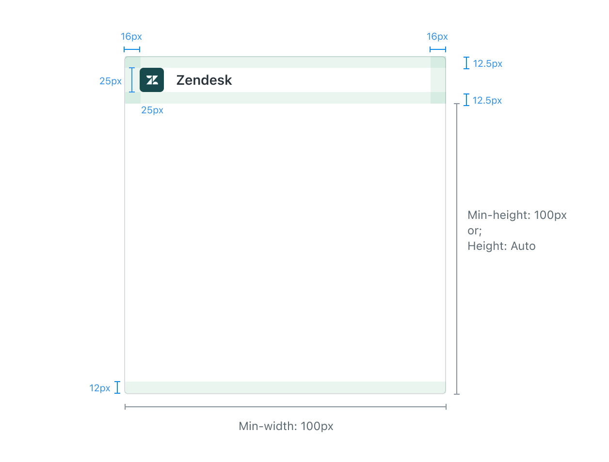
The anatomy of a container window will help you better understand how the structure is created. The minimum width and minimum height (excluding header) of a container are both 100px.
| Font styling | H3 |
|---|---|
| Text styling | #2F3941 |
| Background colour | #FFFFFF |
Dos and Don’ts
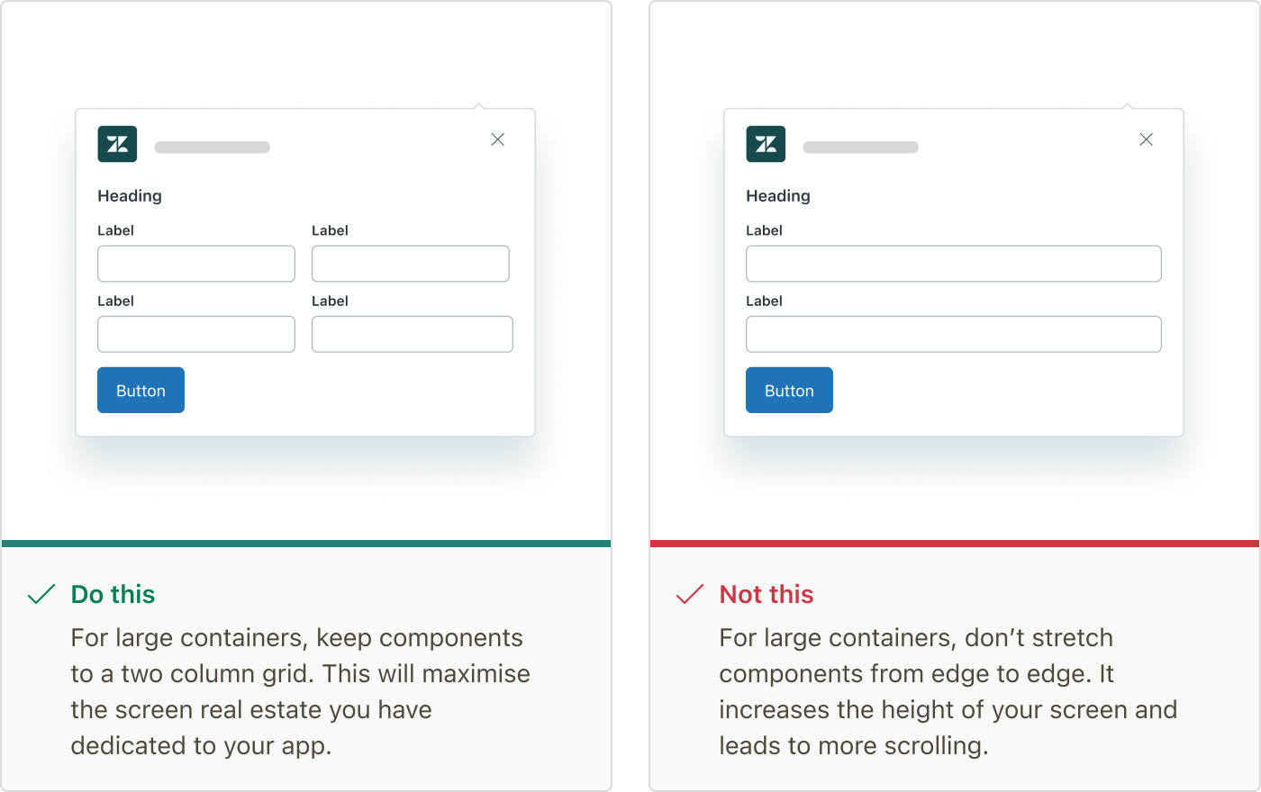
Consider the components in your large format layout
Making use of a two column grid for the large container, will maximise the screen real estate that you have. When people are using your app they will be scrolling less.
Further reading
-
Read up on some of the UI fundamentals Zendesk uses in all of it’s products.
-
Learn about Zendesk’s tone and voice to help write like Zendesk.
-
Explore the Garden website to see all of the components available.