Customizing the look
Customizing the look
This page shows you the different ways that you can customize the SDK UI.
Before you start
Before you start, you should know the following:
- You can customize several colors used in the Unified SDK UI
- You cannot move UI elements, remove parts of the UI, or add new parts
If customizing the UI elements is important to you, consider using the relevant product SDK API providers to build your own UI. See Support SDK providers and Answer Bot SDK providers.
Configuring the Messaging Experience
The MessagingConfiguration class allows you change properties that are shared across product SDKs.
Examples include the agent name used for messages from bots, and the avatar to show with those messages.
MessagingActivity.builder().withEngines(getEngines()).withBotLabelString("Bot Name").show(context);
Using or extending the SDK Material Design theme
The Unified SDK UI relies on a Material Design theme (a style that extends from
Theme.MaterialComponents). The SDK respects light, dark, and light with dark action bar themes.
The colorPrimary, colorPrimaryDark, and colorAccent attributes are used by the SDK so it
will inherit the material theme from your app.
The Unified SDK UI doesn't support Dark Mode nor any heavy customization. Extending those default themes won't personalize the Unified SDK UI. Only the three attributes mentioned above (which change the color of some text, the chat bubbles, and the app's action bar) are supported.
If customizing the UI elements is important to you, consider using the relevant product SDK API providers to build your own UI. See the Chat, Support and Answer Bot providers.
You can extend an SDK theme as follows:
<style name="YourLightTheme" parent="ZendeskSdkTheme.Light">...</style>
<style name="YourDarkTheme" parent="ZendeskSdkTheme.Dark">...</style>
<style name="YourLightTheme.DarkActionBar" parent="ZendeskSdkTheme.Light.DarkActionBar">...</style>
You can then set this theme in your AndroidManifest.xml as follows:
<?xml version="1.0" encoding="utf-8"?><manifest xmlns:android="http://schemas.android.com/apk/res/android"package="com.zendesk.example" >...<application...android:theme="@style/YourTheme".../>...</manifest>
Alternatively, if you don't want to set the theme at the application level, you can
override the theme for MessagingActivity in your AndroidManifest.xml as follows:
<?xml version="1.0" encoding="utf-8"?><manifest xmlns:android="http://schemas.android.com/apk/res/android"package="com.zendesk.example" >...<application ...>...<activity android:name="zendesk.messaging.MessagingActivity"android:theme="@style/YourTheme" /></application>...</manifest>
Using your own theme
If you don't extend an SDK theme, you must still apply a theme that extends from Theme.MaterialComponents
to the MessagingActivity class.
<style name="YourLightTheme" parent="Theme.MaterialComponents.Light"><item name="colorPrimary">@color/my_color_primary</item><item name="colorPrimaryDark">@color/my_color_primary_dark</item><item name="colorAccent">@color/my_color_accent</item></style>
The three attributes above are the only attributes used by the Unified SDK UI from your theme.
Changing the look of each component
If you want to customize the components beyond what's specified in the theme, find the component that you want to customize and look at the layout and values directories of the Unified SDK. These directories contain all the source for the SDK layouts and styles. To find these directories:
- Include our SDK in your build.gradle file as described in Adding the Unified SDK.
- Build your project.
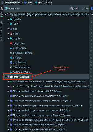
- View the project structure in Project view in Android Studio. Use the file tree
pane on the left side and select Project from the top drop-down menu, which defaults to Android.

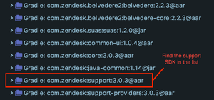
- Open External Libraries at the bottom of the module list and find the directory for the
Unified SDK.
All the SDK layout files are contained in the **layout** directory of the **res** directory in the Unified SDK package.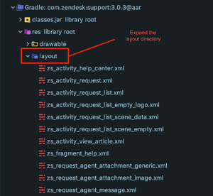
zui_activity_messaging.xml is the layout file for the MessagingActivity. A number of
other layout files for the different views and components are listed in MessagingActivity.
The relevant styles, dimensions, and colors are all defined in values.xml.
To customize the components of other, non-Unified SDK components, look for the relevant directory under External Libraries.