Customizing the look
Customizing the look
This page shows you the different ways that you can customize the UI we provide.
Before you start
Before you start, the following information is useful to know:
- You can customize several colors that are used in the Support SDK UI.
- You can customize the way that help center articles appear using CSS.
- It is not possible to move elements of the UI around, remove parts of the UI, or add new parts. If this is important to you, you should consider using the SDK's API providers to build your own UI.
Material Design theming
Our UI relies on a Material Design theme (ie, a theme that extends from Theme.MaterialComponents). colorPrimary, colorPrimaryDark, and colorAccent.
Use or extend an SDK theme
The SDK has an out-of-the-box UI that requires a Material Design theme (ie, a style that extends from Theme.MaterialComponents). The SDK respects light, dark, and light with dark action bar themes. The colorPrimary, colorPrimaryDark, and colorAccent attributes are used by the SDK, so it will inherit the material theme from your app. You can extend a SDK theme as follows:
<style name="YourLightTheme" parent="ZendeskSdkTheme.Light">...</style>
<style name="YourDarkTheme" parent="ZendeskSdkTheme.Dark">...</style>
<style name="YourLightTheme.DarkActionBar" parent="ZendeskSdkTheme.Light.DarkActionBar">...</style>
You can then set this theme in your AndroidManifest.xml as follows:
<?xml version="1.0" encoding="utf-8"?><manifest xmlns:android="http://schemas.android.com/apk/res/android"package="com.zendesk.example" >...<application...android:theme="@style/YourLightTheme".../>...</manifest>
Alternatively, if you don't want to set the theme at the application level, then you will need to do the following:
<?xml version="1.0" encoding="utf-8"?><manifest xmlns:android="http://schemas.android.com/apk/res/android"package="com.zendesk.example" >...<application ...><activity android:name="zendesk.support.guide.HelpCenterActivity"android:theme="@style/YourLightTheme" /><activity android:name="zendesk.support.guide.ViewArticleActivity"android:theme="@style/YourLightTheme" /><activity android:name="zendesk.support.request.RequestActivity"android:theme="@style/YourLightTheme" /><activity android:name="zendesk.support.requestlist.RequestListActivity"android:theme="@style/YourLightTheme" /></application>...</manifest>
Use your own theme
If you don't extend a SDK theme, you must still apply a theme that extends from Theme.MaterialComponents to the SDK Activity classes. You can specify your own drawable for the request list icon in HelpCenterActivity's Toolbar. Note that there are light and dark versions for the drawables already.
<style name="YourLightTheme" parent="Theme.MaterialComponents.Light"><!-- Conversations drawable icon in SupportActivity --><item name="zs_helpConversationsIcon">@drawable/my_help_conversations_icon_light</item><item name="colorPrimary">@color/my_color_primary</item><item name="colorPrimaryDark">@color/my_color_primary_dark</item><item name="colorAccent">@color/my_color_accent</item></style>
Change the look of each component
The following examples describe how to change the look and feel of the components.
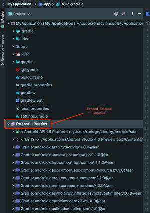
If you want to customize the components beyond what is specified in the theme, find the component that you want to customize and look at the layout and values directories of the Support SDK. These directories contain all of the source for the SDK layouts and styles. To find these directories:
- Include our SDK in your build.gradle file as described in Support SDK in a nutshell.
- Build your project.
- View the project structure in Project view in Android Studio. This means using the file tree pane on the left side and selecting Project from the top drop-down menu, which defaults to Android.

- Open External Libraries at the bottom of the module list and find the directory for the Support SDK.
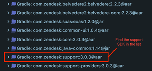
All the SDK layout files are contained in the layout directory of the res directory in the Support SDK package.
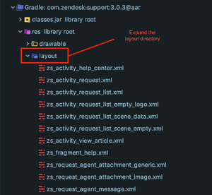
Note: When you have found the layout you want to overwrite, copy the file and paste it into your own res/layout folder with the same name. Only changes made to this new file will be displayed in the app.
| Component | Layout file | Description |
|---|---|---|
| HelpCenterActivity | zs_activity_support.xml | Main Activity of SDK, shows help center content and links to all other Activities |
| RequestActivity | zs_activity_request.xml | Activity for creating, viewing, and updating requests |
| RequestListActivity | zs_activity_request_list.xml | Activity displaying a list of requests |
| ViewArticleActivity | zs_activity_view_article.xml | Activity that displays a help center article |
Change the style of help center articles
To customize the article styles, override the default CSS by creating a file called help_center_article_style.css in your assets directory and override the style definitions listed below.
/*=========================================Resets the styling of all HTML elements to a consistent baseline.=========================================== */html,body,div,span,applet,object,iframe,h1,h2,h3,h4,h5,h6,p,blockquote,pre,a,abbr,acronym,address,big,cite,code,del,dfn,em,img,ins,kbd,q,s,samp,small,strike,strong,sub,sup,tt,var,b,u,i,center,dl,dt,dd,ol,ul,li,fieldset,form,label,legend,table,caption,tbody,tfoot,thead,tr,th,td,article,aside,canvas,details,embed,figure,figcaption,footer,header,hgroup,menu,nav,output,ruby,section,summary,time,mark,audio,video{border:0;font-size:100%;font:inherit;vertical-align:baseline;margin:0;padding:0}article,aside,details,figcaption,figure,footer,header,hgroup,menu,nav,section{display:block}body{line-height:1}blockquote,q{quotes:none}blockquote:before,blockquote:after,q:before,q:after{content:none}table{border-collapse:collapse;border-spacing:0}*, *:before, *:after { -moz-box-sizing: border-box; -webkit-box-sizing: border-box; box-sizing: border-box; }.group:before,.group:after { content: ""; display: table;}.group:after { clear: both;}.group { zoom: 1;}.hidden { display: none; }/*=========================================Default styling for help center articles. Alter this file to customize the styling.=========================================== */body {font: 1em/1.5em "Helvetica Neue", Helvetica, Arial, sans-serif;color:#666;-webkit-font-smoothing:antialiased;text-rendering:optimizeLegibility;margin: 30px;background-color: #ffffff;}a {color: #4ba7f2;text-decoration: none;}a:link {-webkit-tap-highlight-color: #c5c5c5;}strong{font-weight:bold;}h1, h2, h3, h4, h5, h6{color:#333;font-weight:bold;margin-bottom: 20px;line-height: 1.25em;}h1 {font-size:1.728em;}h2 {font-size:1.44em;}h3 {font-size:1.2em;}h4 {font-size:1em;}h5 {font-size:.833em;}h6 {font-size:.833em;}span{font-size: 1em !important;}p, ul, ol{margin-bottom: 40px;}li{margin-bottom: 10px;}ul ul, ol ol{margin-left: 20px;}
Hiding the footer of help center articles
Help center articles include a footer element that displays the author and date of the article's last update.
To hide the footer, add the following to your help_center_article_style.css file:
footer {display: none;}